This is the information about what is needed on each of the days of filming. There is the different shots, which actors, props and costumes that are needed, and finally there is also the date, time and location of each of the filming days.
Field –
Actual Performance
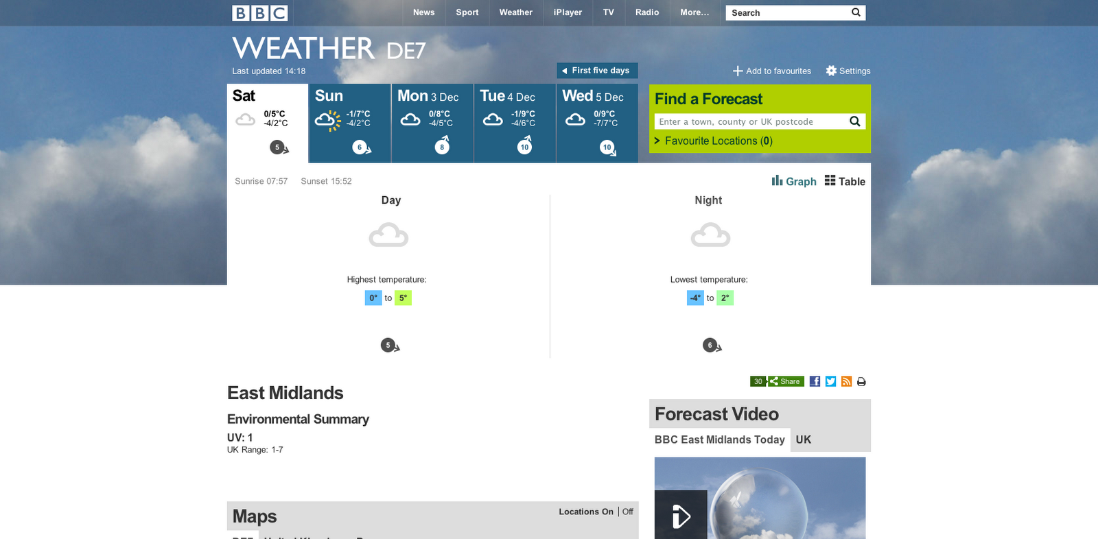
Date: 1/12/2012
Time: 11-4
Location: Field next to – Rose Cottage
Cat
& Fiddle Lane
West
Hallam
Derbyshire
DE7
6HD
Actors needed: guitarist, drummer, and singer
Props needed: guitar, microphone, microphone stand and drums
Costumes: smart/casual, indie
Shots:
Close up singer
Close up drummer
Close up drums
Close up down guitar threat
Close up guitar
Mid shot singer
Mid shot guitarist
Mid shot drummer
Long shot whole band
Cathedral –
Narrative
Date: 2/12/2012
Time: 7:30 – 9:30
Location: 18-19
Iron
Gate
Derby
DE1
3GP
Actors needed: the guy, the robot and the owl
Props needed: 2 chairs, sheets to cover posters, Lego, ‘Do
Not Disturb’ sign, toy bow & arrow, bow & arrow, Hedwig
Costumes: Robot, owl, casual guy
Shots:
Long shot guy walking downstairs
Long shot/Mid shot/track guy walking down corridor
Point of view corridor walk
Long shot guy going to open door, then going to the next
one, then finally going inside one door
Mid shot guy opening door & panning to the room with the
robot
Point of view of a room (Lego, Owl, etc.)
Over the shoulder of a room (empty room)
Mid shot guy going to sit on adjacent chair to robot
Close up guy sitting next to robot smirking
Close up guy waking/sobering up, thinking he is strange
Mid shot guy getting out of the room
Mid shot guy getting out of the corridor
Long shot guy running up stairs
Guitar Hero
Performance
Date: 16/12/2012
Time: 11-4
Location: Rose Cottage
Cat
& Fiddle Lane
West
Hallam
Derbyshire
De7
6HD
Actors needed: guitarist, singer and drummer
Props needed: guitar hero guitar, guitar hero microphone and
guitar hero drum
Costumes: ‘Nerdy’, hoodies, casual
Shots:
Close up singer
Close up drummer
Close up drum controllers
Close up guitarist
Close up guitar threat
Close up guitar
Mid shot singer
Mid shot drummer
Mid shot T.V.
Long shot whole band
Pan from band to T.V.
Close up T.V remote being sat on
Long shot of band confused to T.V being turned off
Close up on T.V remote being pressed so the channel changes
Mid shot of T.V being turned off
Mid shot of T.V with the news and adverts, then its getting
changed to the game