Top 10 albums (13/09/2012)

Artist: The vaccines
Album: Come of age
The cover uses black
and white picture this suggests it is quite boring and indie, the red of the
title gives it some colour to make it stand out, so its suggesting the music
stands out of normal music, but also the text is just plain block capitols and
that suggests it will be very indie.

Artist: Two door cinema club
Album: Beacon
The cover has a colourful picture of a woman stuck to the
ceiling by wind, in some room with green curtains, there is a light coming from the
womans legs and this is suggesting a woman is a beacon. The text looks like an
old cinematic style, this is suggesting the music is quite old styled.

Artist: Rita Ora
Album: Ora
This cover has a big
black and white picture of the artist, she has make up on, an expensive looking
watch, and chains around her, this suggests the music will be mainly a female
singer, that has a slight obsession with herself as she called the album Ora
and she is called Rita Ora.
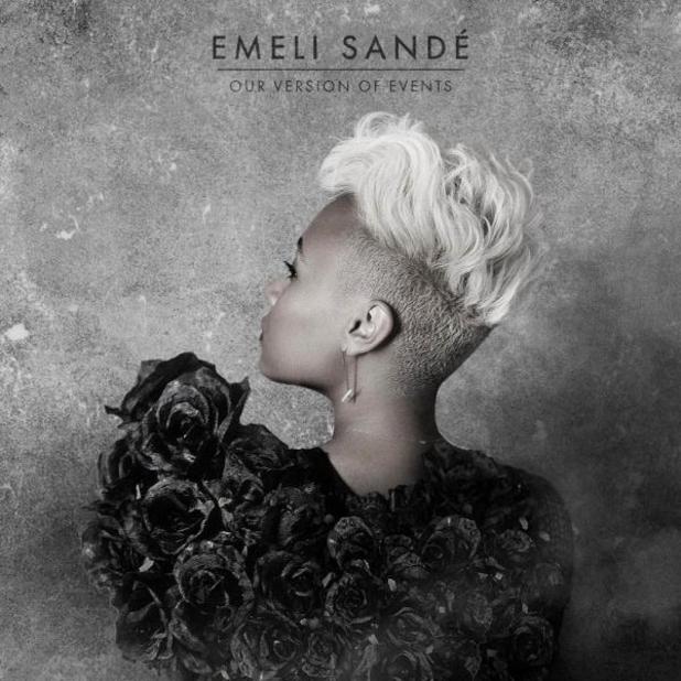
Artist: Emili Sandé
Album: Our version of events
This album cover has a picture of the back of Emeli Sandé
with a colourless background, with a plain black text. This tells us that the
music will be plain and slow, it will be sung by the woman on the front. It is
generically grey.

Artist: Ronan Keating
Album: Fires
This album cover has a
picture of Ronan Keating, it has colour but is plain without much else on
except for the small fire and plain text. This suggests it will be colourful music
but quite plain.

Artist: Plan B
This album cover shows Plan B sitting on a urban wall in
front of a city this suggests that it is urban music for young people who are
familiar with cities. The text is plain and coloured into the rest of the
cover.

Artist: Paloma Faith
Album: Fall to grace
This album cover is
quite colourful, and conceptual, it suggests that the music will be good
because the great image and colours used, but quite slow because the imagery used.
The text isn’t plain it is a unusual font and goes well with the iconography of
the album cover
Artist: Mark Knopflers
Album: Privateering

Artist: Of monsters and
men
Album: My head is an
animal
This album cover is
just a man standing on a beach with some sort of building in the water. The text
is mostly plain but the way the OMAM is highlighted suggests that the music is
more modern then you first think

Artist: Scouting for girls
Album: The light between us
This album cover shows that the album is going to be about
human love shining through. It has plain black text on a light background with
two hands forming a heart shape. It is suggesting the music is aimed for girls
and is created by indie men.
No comments:
Post a Comment