How effective is the combination of your main product and ancillary
texts? (Jessica Daykin)
The elements from the designs of professional CD covers and
website is that we used similar fonts for both our website and CD, which kept
with continuity between the two. We chose the font from ‘dafont.com’ because it
allowed us to select a range of fonts that we felt linked well with the band in
which we were promoting. With the images, we chose to use photos of the band
because the genre of music that the band falls into is pop/indie. In pop music
the images that we see on the covers of the CD or on the website is the
artist/band. On the cover of our digipak we chose to have an image of the band
all together. With the website, the bands official website they don’t have any
photos of them on the front page. However, as we wanted to keep with a
continuity theme we chose to have images of the band on the front page of the
website because we had images of the band on the front of the CD cover.
Originally we had an idea of having images that were a ‘stand-out moment’ in
the music video such as the animation of the band in Lego. We were going to put
the Lego version of the band either on the inside cover of the digipak or the
actual CD, after seeing someone’s previous work in which they used the head of
Lego character and put it on top of a member from the band.
 There were pieces that we didn’t use; one of them was the
blog posts that the band had been posting. These were on the front page of the
website, to show fans what the band were currently up to, telling them about
events and news related to the band. On our website instead of having a bit
with blog posts of the band, we chose to have a twitter feed. This twitter feed
just showed a live commentary of what the band were tweeting, in some ways it
is still like the blog posts however instead of it being separate from the
information they put on twitter, the information they share will be on twitter
and that would be shown on the website. Another element that the band used was
having a section that played the bands music whenever someone clicked on a
particular song of theirs. This is something that we didn’t include as the
website we designed was mainly centred around the band and the music video.
There were pieces that we didn’t use; one of them was the
blog posts that the band had been posting. These were on the front page of the
website, to show fans what the band were currently up to, telling them about
events and news related to the band. On our website instead of having a bit
with blog posts of the band, we chose to have a twitter feed. This twitter feed
just showed a live commentary of what the band were tweeting, in some ways it
is still like the blog posts however instead of it being separate from the
information they put on twitter, the information they share will be on twitter
and that would be shown on the website. Another element that the band used was
having a section that played the bands music whenever someone clicked on a
particular song of theirs. This is something that we didn’t include as the
website we designed was mainly centred around the band and the music video.
On the front page of our website there is a link to the music video which is the product that we were trying to sell and promote. There is a continuity theme that we attempted to keep throughout both the website and the digipak; this was by using the same or similar images. For example, some of the images that appear on the digipak may also appear on the website. Another thing we tried to do with the digipak and website was by using images that promote the band i.e. images in which we can see each of the members of the band. By doing this we target the audience that this band is aimed at (Teens/Young Adults, 60% Female/40%Male, Indie/Pop.
Not only did we use similar images to that of the bands website to promote both the digipak and the website but we also used similar fonts. The font that we used was similar to that of the bands which we wanted to try and replicate because it’s a font that can be identified as being a particular font for the band.

Even though the colour scheme that we used compared with the colour scheme that this website has used they is a contrast, we have used darker colours whereas they have used brighter colours.
Compared with the website that we made there are some similarities, for example, we both have included images of the artist that we are trying to promote. There is also links to various social networking sites that are other ways to promote the artist/band. Another similarity is that they both have a link to the music video that is their latest single that they want to promote.

For the digipak Florence and the Machine have images that include Florence Welch and also images of lungs. The reason for the images of the lungs is because that is what the name of the album is called. The images of Florence Welch are there to promote her as the artist whose album it is.
The font that we used for both our digipak and website is a bold, clear font that can be identified easily as being the font for our chosen band. However with Florence and the Machines font it looks more to be handwritten, which is a consistent theme on both the digipak and website.


The way in which we have kept a clear image and theme throughout our promotion of the band is by trying to keep a continuity flow throughout the whole video, digipak and website. One of the ways we have done this is by using images of the band that have been taken in the locations in which the filming was set in, i.e. the field.
The website, CD cover and video are interrelated as they are all trying to promote the band’s music and the ‘It Gets Better’ song. By doing this we tried to keep with a consistent theme of using the same colour scheme, costumes that the band are wearing are all similar, and also the band can be clearly identified.
The purpose that the website, CD cover and video all share is to promote the band’s music and to target and attract their targeted audience. We wanted to do this by using a colour scheme that is relatable to the genre of music that this band is known to produce (indie/pop) and also the costumes that they wear are easy to identify as being part of that particular genre.

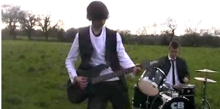
This shot shows the entire band performing.


By Jessica Daykin
No comments:
Post a Comment